 Pb28
Pb28 Responsive Social Share Buttons
Earlier, we discussed responsive web design for designing a login form that adapts to various screen sizes. This tutorial will show how to adapt responsive social share buttons for various device viewports.
To know what responsive design is, refer to this tutorial.
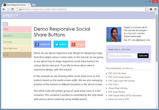
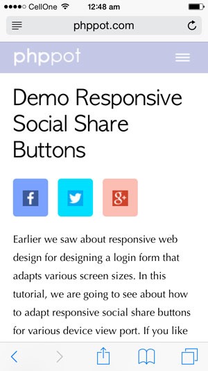
This example shows social share icons or text buttons based on the media screen width. We are also managing the position of the buttons in different locations on the device screen.
In the desktop monitor, the output will be,
In mobile browsers,
HTML Code with Responsive Share Buttons
The HTML code containing the group of social share buttons is,
html
<html>

<head>

<TITLE>Responsive Social Share Buttons</TITLE>

<link href="style.css" rel="stylesheet" type="text/css" />

</head>

<body>

	<h1>Responsive Social Share Buttons</h1>

	<div id="share-box">

		<div class="btnShare btnFacebook">

			<img src="facebook.png" class="icon-share"><span class="txt-share">Facebook</span>

		</div>

		<div class="btnShare btnTwitter">

			<img src="twitter.png" class="icon-share"><span class="txt-share">Twitter</span>

		</div>

		<div class="btnShare btnGoogle">

			<img src="google-plus.png" class="icon-share"><span class="txt-share">Google</span>

		</div>

	</div>

	<div class="txt-content">

		<p>Few days before we have seen about responsive web design for

			designing a login form that adapts various screen sizes. In this

			tutorial, we are going to adapt responsive social share buttons for

			various device view port.</p>

		<p>In this example we are showing either social share icons or text

			based on the media screen width. We are also managing position of the

			buttons to be adapted within the device screen.</p>

		<p>The HTML code will contain group of social share icons in a DIV

			container. This container's position is controlled by the style sheet

			with various device screen by using medial queries.</p>

	</div>

</body>

</html>
CSS for Responsive Share Buttons
This style sheet contains media queries to manage the social share button positions using CSS position and float properties.
css
body {

	width: 610px;

	margin: 0 auto;

}


#share-box {

	position: relative;

	float: left;

}


.btnShare {

	float: left;

	padding: 10px;

	margin-right: 15px;

	cursor: pointer;

}


.btnFacebook {

	background: #7AA2FE;

}


.btnTwitter {

	background: #00DEFF;

}


.btnGoogle {

	background: #FCBDB3;

}


.txt-content {

	clear: both;

	padding-top: 5px;

}


.txt-share {

	color: #FFF;

	padding-left: 5px;

}


@media screen and (min-width: 845px) and (max-width: 1044px) {

	body {

		width: 50%;

		margin: 0 auto;

	}

	#share-box {

		position: absolute;

		top: 100px;

		float: left;

	}

	.btnShare {

		clear: both;

		padding: 15px;

		cursor: pointer;

		border-bottom-left-radius: 5px;

		border-top-left-radius: 5px;

		margin-bottom: 15px;

	}

	.txt-content {

		border-left: #F0F0F0 1px solid;

		padding-left: 20px;

		margin-left: 54px;

	}

	.txt-share {

		display: none;

	}

}


@media screen and (max-width: 844px) {

	body {

		width: 80%;

		margin: 0 auto;

	}

	.btnShare {

		float: left;

		padding: 15px;

		cursor: pointer;

		border-radius: 5px;

	}

	.txt-share {

		display: none;

	}

}