 Pb28
Pb28 How to Build a Responsive React Navbar with Dropdown and Mobile Menu
A responsive navigation bar is a one of a must-needed requirement of any modern web application. It is an easy job if the navigation bar contains single level menu and action controls. But, it will be complex it is a multi-level menu to fit the layout into a small viewport.
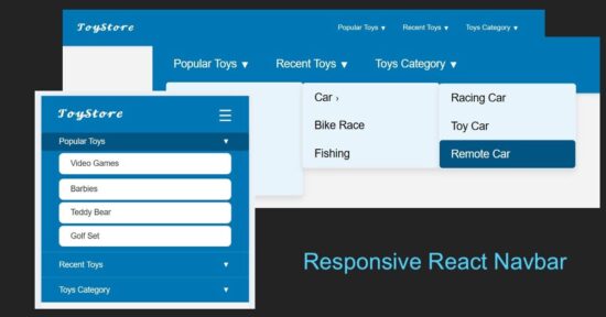
With this React example code you’ll learn how to build a responsive React navbar. It includes a multi-level dropdown menu for different view port. It will a plugable and reusable React component for your different application frontend.
Responsive navbar in React header
This React JSX code has the a responsive navigation bar component. It provides 1) menu bar with Desktop and mobile variants, 2)sub menu bar with click-to-expand effect.
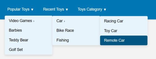
The menuData contains the array of multi-level menu items. The image shown below renders the horizontal menu on the site header.

import { useState } from "react";

import menuData from "./MenuData";

import Dropdown from "./DropDown";

import "../../../public/assets/css/style.css";


const Navbar = () => {

  const [menuOpen, setMenuOpen] = useState(false);

  const [openIndex, setOpenIndex] = useState(null);


  const toggleSubmenu = (index, e) => {

    if (window.innerWidth <= 768) {

      e.preventDefault();

      setOpenIndex(openIndex === index ? null : index);

    }

  };

return (

  <nav className="navbar">

    <div className="navbar-container">

      <h2 className="logo"></h2>

      <button

        className="menu-toggle"

        onClick={() => setMenuOpen(!menuOpen)}

        aria-label="Toggle menu"

      >

        ☰

      </button>

      <ul className={`menu ${menuOpen ? "open" : ""}`}>

        {menuData.map((menu, i) => (

          <li key={i} className="menu-item has-submenu">

            <a href="#" onClick={(e) => toggleSubmenu(i, e)}>

              {menu.title}

              <span className="expand">▼</span>

            </a>

            {menu.subMenu && (

              <Dropdown

                items={menu.subMenu}

                className={openIndex === i ? "open" : ""}

              />

            )}

          </li>

        ))}

      </ul>

    </div>

  </nav>

);

};

export default Navbar;
These are the main and submenu items defined for this React example.
const menuData = [

  {

    title: "Popular Toys",

    subMenu: [

      {

        title: "Video Games",

        subMenu: [

          { title: "Car", subMenu: ["Racing Car", "Toy Car", "Remote Car"] },

          "Bike Race", "Fishing"

        ]

      },

      "Barbies", "Teddy Bear", "Golf Set"

    ]

  },

  {

    title: "Recent Toys",

    subMenu: [

      "Yoyo", "Doctor Kit",

      { title: "Fun Puzzle", subMenu: ["Cards", "Numbers"] },

      "Uno Cards"

    ]

  },

  {

    title: "Toys Category",

    subMenu: [

      "Battery Toys",

      { title: "Remote Toys", subMenu: ["Cars", "Aeroplane", "Helicopter"] },

      "Soft Toys", "Magnet Toys"

    ]

  }

];


export default menuData;
React menu dropdown hooks to toggle submenu
A component Dropdown returns the submenu look-and-feel. The React state openIndex has the menu open/close state by its index.
The Dropdown component’s expand/collapse state is depends on the menuOpen set with a toggle action. The menu toggle effect is for the mobile view to slide down the menu options on clicking a burger icon.
import { useState } from "react";


const Dropdown = ({ items, className }) => {

  const [openIndex, setOpenIndex] = useState(null);


  const toggleSubmenu = (index, e) => {

    if (window.innerWidth <= 768) {

      e.preventDefault();

      setOpenIndex(openIndex === index ? null : index);

    }

  };

  return (

    <ul className={`dropdown ${className || ""}`}>

      {items.map((item, i) =>

        typeof item === "string" ? (

          <li key={i}>

            <a href="#">{item}</a>

          </li>

        ) : (

          <li key={i} className="has-submenu">

            <a href="#" onClick={(e) => toggleSubmenu(i, e)}>

              {item.title}

              <span className="expand">›</span>

            </a>

            {item.subMenu && (

              <Dropdown

                items={item.subMenu}

                className={openIndex === i ? "open" : ""}

              />

            )}

          </li>

        )

      )}

    </ul>

  );

};

export default Dropdown;
Mobile menu navbar view
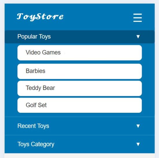
This heading shows the mobile view of this responsive navbar. In the mobile view, a burger icon will be appeared on the top right corner of the web layout.
This icon’s click event is bound to toggle a sliding menu. In this sliding menu, each menu items are vertically expandable to show its submenu.
References: